OVERVIEW
The Challenge
Genesis, an automated portrait editing service that uses artificial intelligence for large-scale post production, needed to improve its web application to encourage new and existing customers to try its services.
The Process
A redesign based on research that updated features and improved functionality.
Redefined information architecture so that people could better navigate and interact with the product.
Updated visual identity of the brand.
The Solution
An updated website application with clear navigation, interactions, and reliable features for engaging potential customers.
Please note that the Genesis web application is constantly evolving
RESEARCH
Qualitative Research
In order to identify pain points within the web application , I organized two qualitative research efforts:
Field Observations: visiting a local portrait studio for the purpose of orienting myself to the real-world context that the post production team operates within, and use gathered insights to formulate meaningful and directed questions.
Semi-structured usability tests: engage stakeholders with open-ended questions about Genesis. Questions were created by insights from previous observations to gain a greater understanding of how tasks are managed, tracked, and selected.
Affinity Map
Notes gathered during user research were placed within an affinity map for the purpose of finding pain points related to certain tasks. Insights (yellow) recorded and synthesized into themes (blue) and unique pain points (red).
The pain points with the most potential client impact were isolated for the next phase of design:
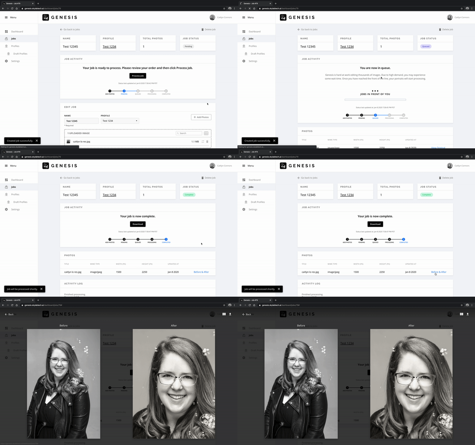
Users didn’t know what was happening when creating a new job. There was limited feedback from the product.
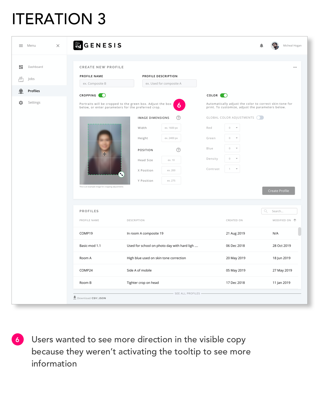
Users had a hard time understanding the wording used within the application.
Target User
Two personas were created and based on the information available from previous research. Screens and features were driven by the contexts of these two personas.
DESIGN DEVELOPMENT
User Flow
I then developed a set of user flows in order to map out the potential paths users would take when interacting with the site. The user flows were especially crucial to ensure that I would design the necessary pages and calls to action to allow the user to easily engage with the site.
Wireframes and Prototyping
After synthesizing the user research, and user flows, I sketched out low-fidelity wireframes. These sketches were key to identifying overall design direction, experimenting with page layouts, mapping key calls to action, and iterating early.
I then developed the sketches into mid-fidelity wireframes using Sketch. Once completed, I brought the wireframes into Invision and created the prototype.
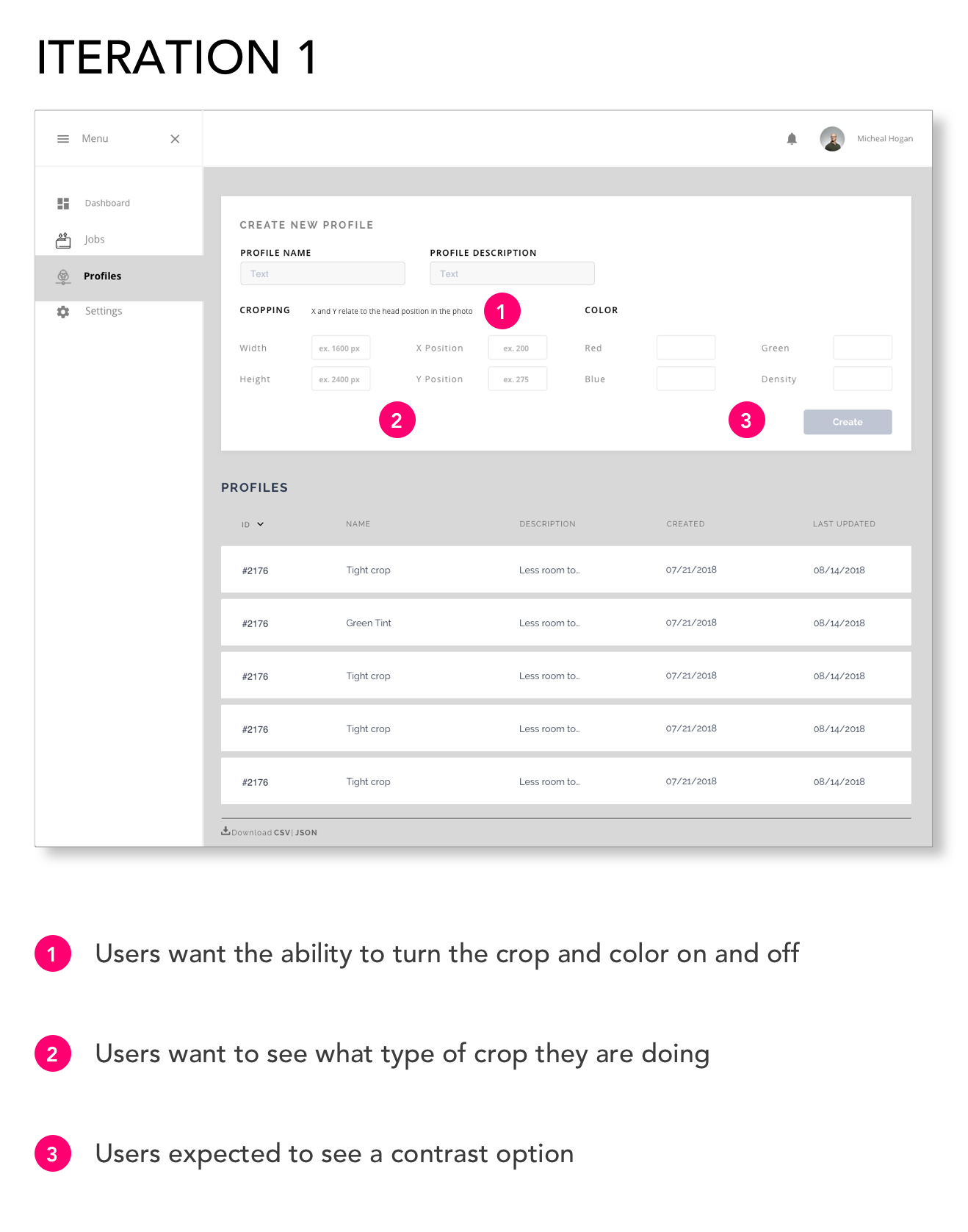
Usability Testing and Iterating
Iterations: 4 rounds
User Testing: 3 rounds
After rounds of iteration, the web application was shipped and developed. I worked with the developers to identify areas of structural and aesthetic improvements. We continue to monitor and adapt the web application based on patterns from visitor feedback.
Job Queue Iterations
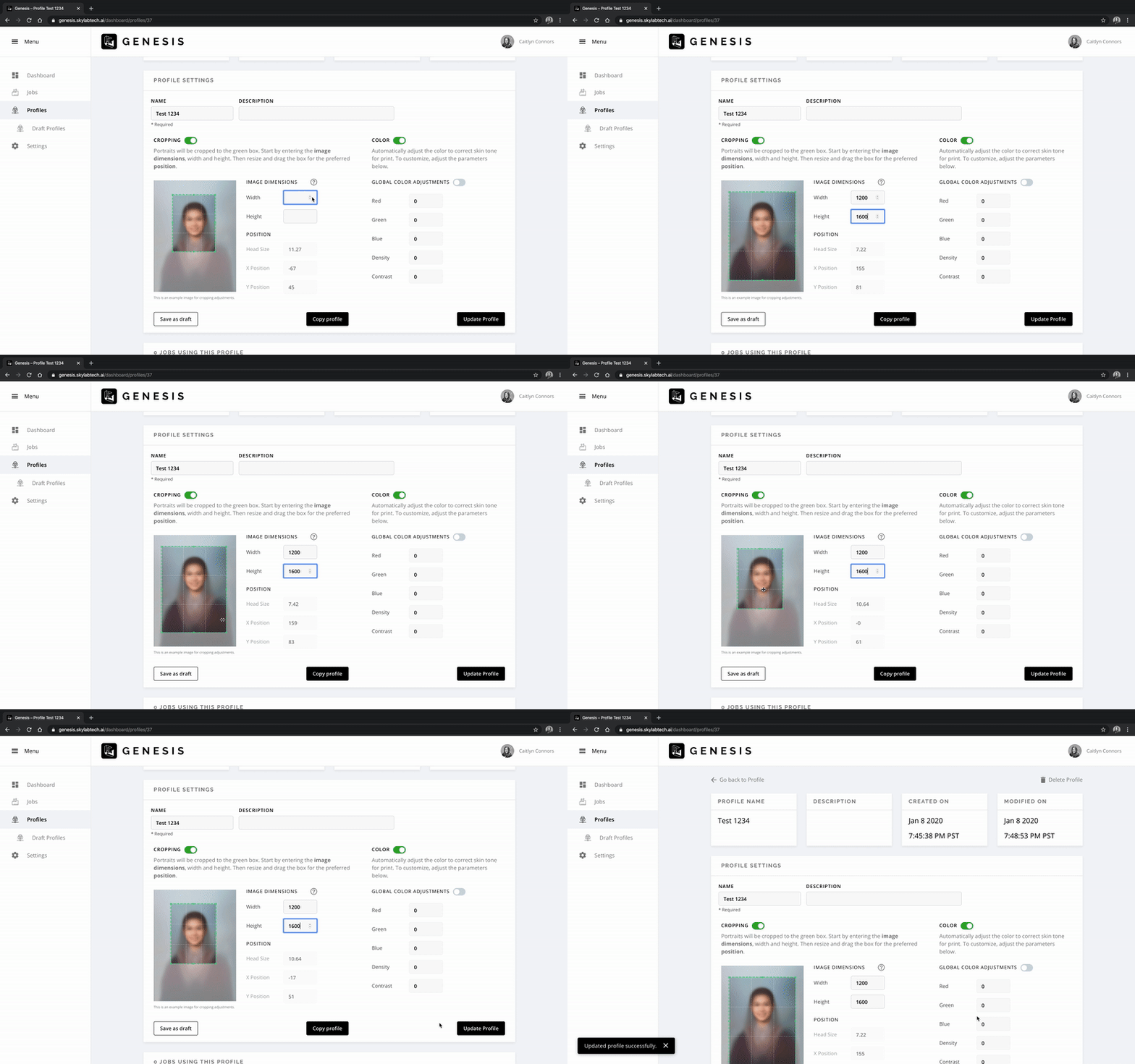
Profile Iterations
DESIGN SOLUTION
Based on feedback from participants in usability tests, it was clear that users value consistency, organization, and ease of navigation, all of which are important factors to consider in designing any page. Design is never done, but I am exciting to keep testing, iterating, and improving this web application.
CONCLUSION
Takeaways
I gained valuable experience working with developers to bring my designs to life as well as learned how important communication is.
Done is better than perfect! It is more beneficial to complete something so it can be tested and improved, instead of taking too much time to be pixel perfect.


